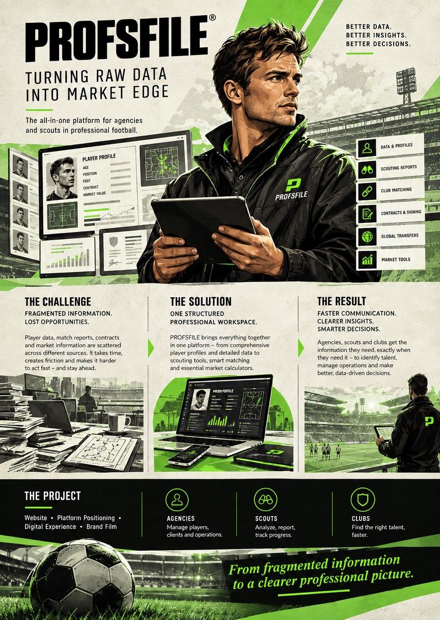
Communication takes many forms
A brand film. A website. An information sheet. A campaign. A visual story. A completely new way of explaining something people thought they already understood.
Here we present selected projects to show how ideas, cause and effect, relationships, brands, products and messages can be turned into communication people notice, understand and remember.
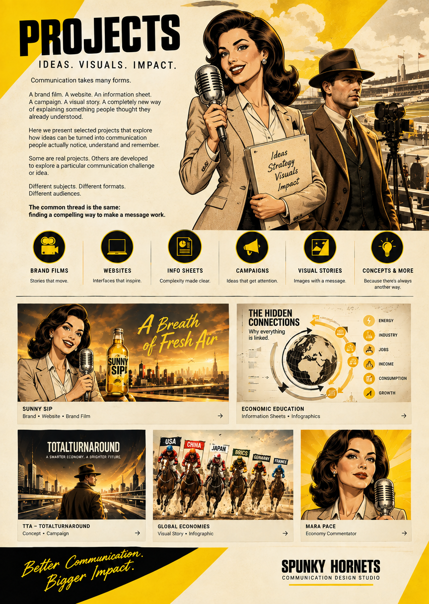
Here are some Use Cases: SUNNY SIP (Brand/Product) | TTA (Politics/Economics) | PROFSFILE (Product/App)
SUNNY SIP
Challenge
Create a beverage brand that people would actually remember.
Communication idea
Don’t simply show a bottle.
Give the brand a world, characters and a story.
Strategy
1928 Chicago. Prohibition. Speakeasies. Gangsters.
Sunny Sip becomes part of that world rather than interrupting it.
Design
Brand identity → bottle → characters → environment → cinematic language.
Execution
AI-generated imagery + AI filmmaking + editing + sound.
Result
A brand with an identity, a universe and a memorable story.
We don’t just create content. We create stories people enjoy watching.
A Fictional Brand in a Cinematic World
What if a simple bottle of lemonade became the centerpiece of a stylish gangster story set in 1928 Chicago?
The Sunny Sip concept explores exactly that idea. Instead of relying on traditional advertising, we place a fictional brand into a carefully crafted cinematic universe inspired by the elegance of the Roaring Twenties. Art Deco architecture, vintage automobiles, jazz clubs, impeccably dressed gangsters, glamorous nightlife, and the atmosphere of the Prohibition era create a visually rich backdrop for entertaining stories filled with humor, suspense, and action.
By blending historical inspiration with modern AI filmmaking, products become a natural part of the narrative rather than the focus of a sales pitch. A chase through the city, a secret speakeasy, or an unexpected twist can make a brand memorable because audiences enjoy the story itself.
This approach demonstrates how AI-powered visual storytelling allows virtually any product or brand to be placed into unique worlds and time periods, creating distinctive campaigns that are both entertaining and unforgettable.




TTA
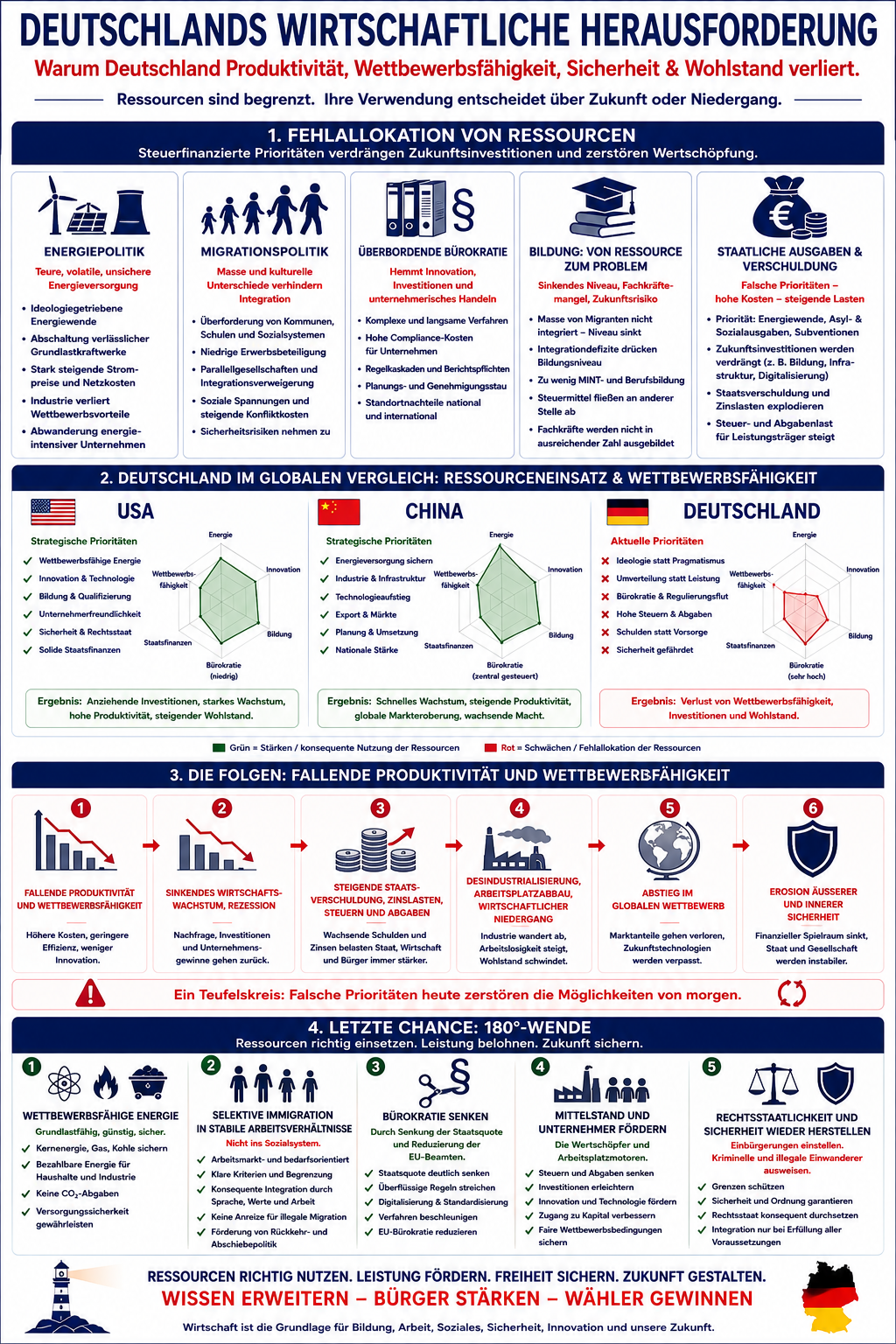
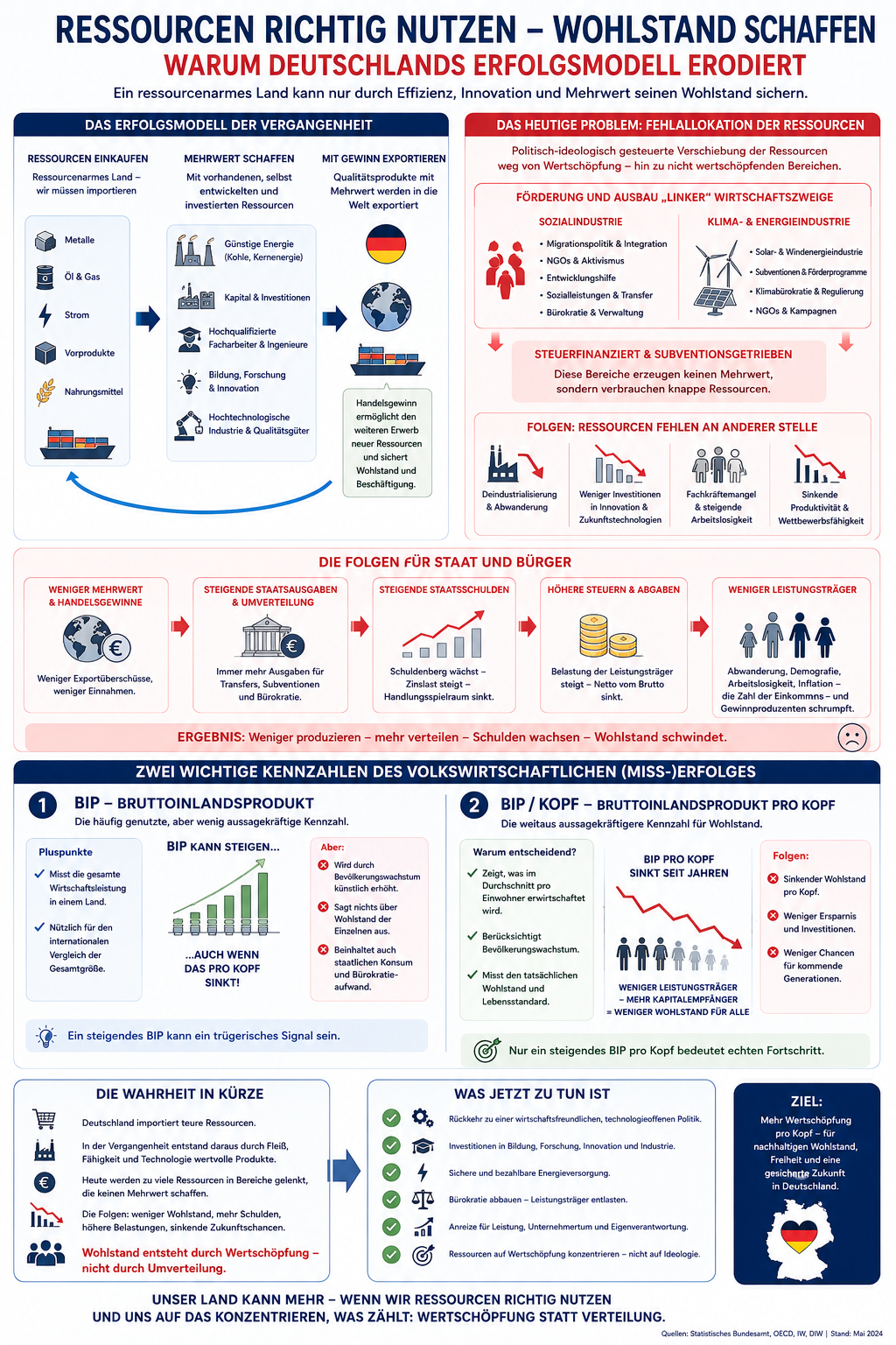
Making ECONOMIC REALITY understandable
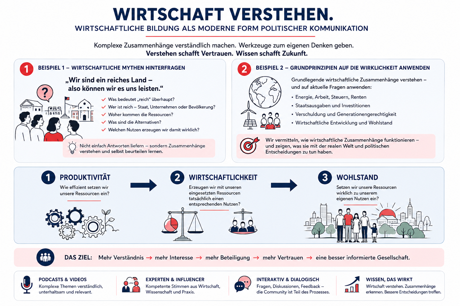
TTA (“Total Turnaround”) is a fictional political movement founded on the conviction that many of today’s political and economic problems cannot be understood through slogans, isolated statistics or campaign promises.
Its central idea is simple:
Before people can make informed political choices, they need to understand the economic relationships behind those choices.
TTA therefore wants to make economic knowledge a central part of its communication — not through lengthy policy papers, but through clear, accessible and visually engaging explanations.
THE CHALLENGE
How do you explain complicated economic relationships to people who have neither the time nor the inclination to read a 50-page economic report?
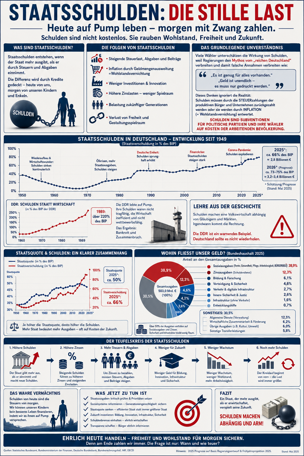
How do you make a connection between politics, government debt, taxation, inflation, investment, immigration, ressource allocation, productivity, wages, etc. and prosperity / economic success or failure visible at a glance?
And how do you make people want to understand it?
TTA wants to win voters by making them better informed about the economic relationships underlying political choices.
THE APPROACH
1 — RESEARCH
Gather the relevant data, statistics, studies and sources.
Not every available number is useful. The first task is to determine which information actually matters to the question being explained.
2 — CONNECT
Look beyond isolated figures.
Identify:
cause and effect
dependencies
feedback loops
trade-offs
unintended consequences
relationships between seemingly unrelated developments
This is where “make people see things they hadn’t noticed before” becomes tangible.
3 — DESIGN
Turn those relationships into Visual Explainers.
Instead of:
“Here are 17 statistics about government debt.”
show:
Where does the money come from?
Where does it go?
Who ultimately pays?
What happens next?
Charts, diagrams, comparisons, timelines and concise explanations allow the audience to see the system rather than merely read about its individual parts.
4 — ENGAGE
Don’t stop at the DINA4 sheet.
The same underlying information can become:
Visual Explainer
→ one-page overview
Short Video
→ explain one relationship in 60–90 seconds
Interactive Tool
→ let people change a variable and see the consequences
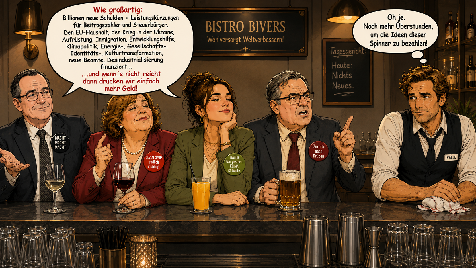
Social Content
→ isolate individual insights
Educational Series
→ gradually build economic literacy
Website / Podcast
→ connect the whole knowledge system
PROFSFILE
Turning football data into actionable insight
ProfsFile brings player profiles, performance data, scouting information, contracts, transfers and market intelligence together in one structured platform for agents and scouts. Our project shows how a complex data-driven service can be transformed into clear, engaging communication — combining a digital platform, visual storytelling and a distinctive brand film to make its value immediately understandable.