
Making complex subjects understandable
People are bombarded with information all day — on screens, in feeds, in meetings, in reports, in newspapers, on websites.
And yet, far too much of it still arrives as walls of text, endless slides, dry documents and lifeless statistics.
We think there is a better way.
The essentials can fit on one well-designed VISUAL BRIEF.
Or they can be explained in 60 seconds of film.
Sometimes we´ll even make use of an interactive tool, a visual story or something completely different.
We bring good design, smart structure, strong visuals, aesthetics, storytelling and even fun into the package from the very beginning — not as decoration added at the end.
Economic, financial, scientific, social and political subjects are often communicated through lengthy reports, theories, technical documents and abstract statistics.
We explore ways of turning those subjects into clear visual explanations, interactive experiences and educational material that allow audiences to understand not just the numbers, but the relationships behind them.
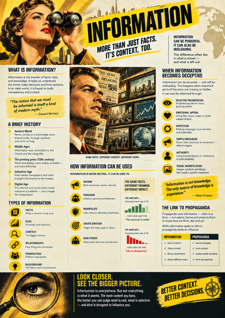
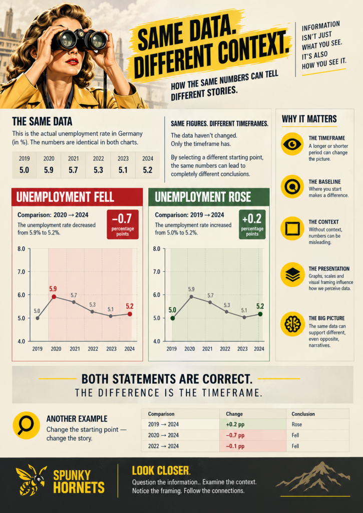
We don’t want to tell people what to think.
We want to make it easier for them to think for themselves.
That means going beyond the headline.
Don’t just show the number.
Show where it comes from.
Don’t just make the claim.
Show the context.
Don’t just present the conclusion.
Show the relationships that lead to it.
When people can see the data, the context, the connections and the consequences, they can examine an argument themselves.
We help people connect the dots.